Our main character will be lying in a field looking as if he has been beaten up or been involved in an accident. Throughout the video we will show him with is new lease of life enjoying life to its fullest, as well as looking back to his past and his fondest memories.
We will use a sped up shot that will have a decreased frame rate, that will transition to different locations.
Sunday, 31 October 2010
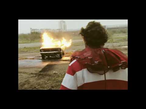
AO - Just Jack- The Day I Died
Just Jack - The Day I Died on MUZU.
This video is useful for the ending, if we want the character to die. The main character also has been injured, so this is useful as we are looking to create a similar effect.
Reccie and Practice Shots
James and I went on a reccie in Southborough common and in the wooded area surrounding. We learnt quite alot during this reccie. The thing i found most interesting was the amount of footage that will be needed. It is going to take much longer then i first anticipated to get all the video needed. I felt the reccie was successful and we may be able to use some of the footage in our real A2 Piece.
Thursday, 21 October 2010
AO - New Shot Ideas
We could have a picture on a wall of a field , which is black and white. The camera then zooms in on the picture, this acts as a transition to which we have a shot of the field (still in black and white) with the lead singer/main character walking through it in colour.
Another possible shot that we could use is, having a mid-shot the lead singer, and use stop-animation to add or take away injuries from him. Or something that is similar to that.
Another possible shot that we could use is, having a mid-shot the lead singer, and use stop-animation to add or take away injuries from him. Or something that is similar to that.
Group - 21/10/10
In this lesson we are going to the studio to do a reccie and test shots, to help with the performance elements of our music video. We will also be experimenting with artificial lighting. We will practice lip syncing which is important as it is prominent in our concept, as well as practicing our 360 panning shot.
Tuesday, 19 October 2010
HAve a look at this
click here - sebastian Teller - La Ritournelle
Interesting use of photos / stop motion / meaning of life
Interesting use of photos / stop motion / meaning of life
AO - Will Young-Changes
http://www.youtube.com/watch?v=PMTitB-yNTc&ob=av2e
Concept idea???
It's similar to what we are looking to do- abstract.
Concept idea???
It's similar to what we are looking to do- abstract.
Group - New Concept Ideas
Lead singer/main character has suffered a near death experience. This encourages him to see life in a different way and expresses his new love for life.

Within this idea there will be 360 degree pans of the lead singer, which cuts to still pictures of his childhood or past experiences. This will also act as a transition to different locations that the main character will find himself in.
We have developed shot ideas for the video, one will be of a location in black and white, with one notable feature or the main character in colour, so it acts like a contrast to the rest of the shot.

This is a similar shot to which we want to have in our music video. Maybe as an opening shot for the sequence.
Monday, 18 October 2010
Feedback #2
I like the design and use of the blog - effective use of ICT. You do have some relevant secondary research here - however there are some urgent amendments / additions:
1. Where are the results from your audience research?
2. Each technical analysis post should have an evaluation - what did you learn and how did this inform your concept?
3. You posted an initial concept idea on 1st October - but there seems to be no development of this concept recorded since then. You must document creative process and all your new ideas
4. Pitch slides and evaluation - this week
5. What other videos have you looked at recently?
6. What is your final idea?
You must be reflecting on your skills progression and documenting the creative process in preparation for the exam in June too.
BE READY TO PITCH p1 TOMORROW PLEASE - SLIDES OR NO SLIDES
Thursday, 14 October 2010
TM - Richard Dyer
The key Ideas of Dyer are;
Stars depend upon a range of subsidiary media – magazines, TV, radio, the Internet – in order to construct an image for themselves which can be marketed to their target audiences.The star image is made up of a range of meanings which are attractive to the target audiences. Richard Dyer had two paradox's;
The first Paradox
Is that the artist should be both present and absent
The second Paradox
The artist has to be ordinary and extra ordinary
In reference to the music video I analysed Jamie T sticks and stones there many key ideals by Dyer that I think I relevant. There is a lot of extra Diegetic Gaze which enables the audience to view very closely what he looks and acts like. This as Dyer says help s them market to their target audience.
This extradiegetic gaze allows the audience to view the costume which the star is wearing. He can then portray this through his Star Motif. Getting the image of the star out to the consumer is very important as it allows them to view him. The director must consider this very carefully as if he gets it right it can make the band very successful.
Dyer constructed the roll of style in TV and Music. A star is an image constructed by a range of materials
Music video
Adverts
Digipak
Considering music video, what techniques are used to construct a particular image?
Close-ups create para-social intimacy. the consumer is repeatedly able to view the star in detail. This enables the star to communicate his ideals and style to the audience. This is evident in the music video Sticks and Stones, as Jamie T is looking into the camera and singing most of the time.
Dyer Suggests that the editing of the music video and the use of posed shots of the star creates an incoherent message. The audience therefore strives to consume more products in order to complete this image.
In the music industry, performance seems to promise the completion of the image, but it is always ultimately unsatisfying. This is in conjunction with his paradox 2.
Stars depend upon a range of subsidiary media – magazines, TV, radio, the Internet – in order to construct an image for themselves which can be marketed to their target audiences.The star image is made up of a range of meanings which are attractive to the target audiences. Richard Dyer had two paradox's;
The first Paradox
Is that the artist should be both present and absent
The second Paradox
The artist has to be ordinary and extra ordinary
In reference to the music video I analysed Jamie T sticks and stones there many key ideals by Dyer that I think I relevant. There is a lot of extra Diegetic Gaze which enables the audience to view very closely what he looks and acts like. This as Dyer says help
 s them market to their target audience.
This extradiegetic gaze allows the audience to view the costume which the star is wearing. He can then portray this through his Star Motif. Getting the image of the star out to the consumer is very important as it allows them to view him. The director must consider this very carefully as if he gets it right it can make the band very successful.
Dyer constructed the roll of style in TV and Music. A star is an image constructed by a range of materials
Music video
Adverts
Digipak
Considering music video, what techniques are used to construct a particular image?
Close-ups create para-social intimacy. the consumer is repeatedly able to view the star in detail. This enables the star to communicate his ideals and style to the audience. This is evident in the music video Sticks and Stones, as Jamie T is looking into the camera and singing most of the time.
Dyer Suggests that the editing of the music video and the use of posed shots of the star creates an incoherent message. The audience therefore strives to consume more products in order to complete this image.
In the music industry, performance seems to promise the completion of the image, but it is always ultimately unsatisfying. This is in conjunction with his paradox 2.
Wednesday, 13 October 2010
JP - Richard Dyer

Richard Dyer is a critical theorist, and considered the role of stars in TV and music. He said a star is an image, constructed out of a range of materials (music video, advertising, digipak). Stars are commodities produced, consumed on the strength of their meanings.
So in reference to my music video analysis where I analysed 'She Moves in Her Own Way' by 'The Kooks'. There are a lot of close ups that create a para-social intimacy. By allowing the consumer to repeatabley be able to see the star in detail, the star in turn through extra-diegetic gaze makes the connection with the audience. The costume the lead singer wears and the attitude that is portreyed through this is his star motif and gives him an identifiable image that helps less focused viewers identify the band and makes them more recognisable, and in turn succesful.
Dyer suggests that the editing of a music video an the use of posed shots of the star creates an incoherent message. The audience therefore strives to consume more products in order to complete the image, but is ultimatley unsatisfying.
Tuesday, 12 October 2010
JP - Deconstruction of an Advert

Genre
How is the genre of the track/artist evident?
The genre of this band and album is indie/alternative rock. This is evident through the mise en scene of the advert, firstly their costume consists of jeans, t-shirt and cardigans or jumpers, they are dressed very casually, if not 'scruffy'. By them being 'dressed down' it challenges the conventions of the glamorous popular culture, thus evidence of them being in the more niche indie genre. Also the lack of colour in the advert, with only the album name in red, all the rest being in black and white, conforms to the conventions of this genre.
Media Language
What visual techniques are used?
A mirror shot is used in this advert to show the fourth member of the band where he is not seen in the main shot, this allows a closer shot of the band member and shows a more realistic formation of a band practicing as they would normally practice in a circle, it gives a sense of realism. It is an interesting technique that is aestheicaslly pleasing for the viewer. Another visual technique used is that it is in black and white, which gives it a stylized look that conforms to the genre they are targeting.
What linguistic devices have been used?
The only writing on the advert written with colour is the album name, this is a clear technique that is creating a reading path for the viewer, it attracts you first to the album title and will stand out from the page. By doing this they have distinguished the important information straight away and will help it to be consumed by a more passive audience.
Is there any intertextuality/reference to popular culture?
As this target audience of this advertisement is not the mainstream audience, it is not necessary to have references to the popular culture and this advert could be described as being postmodern.
Representation
How are the band/artist represented?
This advert shows that the band are not conforming to the traditional conventions of the popular culture, meaning that they are represented against the mainstream beliefs of society. They could be said to be 'rebellious' as they are not complying to traditional conventions, by their costume and their messy hair styles.
Institution and audience
How might this print text be consumed?
I think that this advert will be consumed through posters and in magazines such as NME, and as it is not a elaborate advert it is most likely to be consumed in a focused way.
AO - Richard Dyer
Richard Dyer considered the role of stars in different media texts. He said that a star is a image, constructed out of a range of materials, that the star has created. He also says that stars are commodities, that are produced and consumed. Stars depend upon a range of subsidary media in order to construct an image for themselves which can be marketed to their target audience.
With reference to the music video that i analysed, The Arctic Monkeys - Flourescent Adolescent. As the band were not featured in this video it is very hard to consider Dyer for this, the band did not create a para-social intamacy with the audience, as there weren't any close-ups of the band. However the audience were constantly reminded of the band through the lead singer's grain of voice, which is very recongisable. So the star's motif is present throughout the music video and can be easily recongisable for the audience that are consuming the text. Dyer's paradox 2 is evident in this music video, as the band are very much absent within the video, but at the same time they are present, as their song is playing throughout the video, and so the audience are constantly reminded of the band. This ma kes the audience strive for more products to consume, so that they can complete the star's image.
With reference to the music video that i analysed, The Arctic Monkeys - Flourescent Adolescent. As the band were not featured in this video it is very hard to consider Dyer for this, the band did not create a para-social intamacy with the audience, as there weren't any close-ups of the band. However the audience were constantly reminded of the band through the lead singer's grain of voice, which is very recongisable. So the star's motif is present throughout the music video and can be easily recongisable for the audience that are consuming the text. Dyer's paradox 2 is evident in this music video, as the band are very much absent within the video, but at the same time they are present, as their song is playing throughout the video, and so the audience are constantly reminded of the band. This ma
 kes the audience strive for more products to consume, so that they can complete the star's image.
Monday, 11 October 2010
Captains Log 11/10/10
We have continued on our pitch and have now done the basics of it. We also have discussed a location reccie for tomorrow morning.
Development of our Idea
Development of our Idea
Audience Research
We have created a questionnaire using www.surveymonkey.com, and have posted the following link on Facebook to distribute it to our target audience.
Click here to take survey
Click here to take survey
Sunday, 10 October 2010
JP - Deconstruction of a Digipak
The Klaxons - Myths of the Near Future
 The Klaxons are a band with a similar target audience to The Kooks, so i have to decided to deconstruct this albums digipak as it is of similar genre to the digipak we will be making for our band.
Genre
How is the genre of the track/ artist evident?
The genre of this artist is alternative rock. This is shown in the cover art by it being so abstract, the randomness that can be associated with the 'rock and roll' culture is evident through the medium of collage, seemingly random images have been put together and have created an image that will make them stand out, this supports its alternative status, by not sticking with traditional conventions of the popular culture. It is a good example of challenging conventions and could be considered postmodern.
Media Language
What visual techniques are used? How is meaning generated through these? What are the linguistic signs?
The cover art of this album cover uses a scrapbook, collage technique and makes the page very 'busy' a lot of things are happening with lots of bright colours and is very abstract. It uses techniques that challenge the conventions of most album covers that will generally be very simple and uncluttered. Despite this being cluttered the reading path still allows the viewer to see all the key information easily. The album title is very prominent in the cover art and is displayed on a crossword grid, this connects to the title of the album which is called 'Myths of the Near Future', connoting puzzles and mystery.
The way in which each image is displayed creates a reading path for the viewer and makes us look at it in a certain order, this is a technique used to attract the attention of the viewer. Attracting the attention of the audience is the main goal of this cover art by the us of vibrant colours and intrigues the audience. These images all presents relationships with the album title, there is a very mystical theme and the eyes connote looking into the future.
Representation
How are the band/artist represented?
The Band are certainly represented as postmodern through this digipak, they show themselves not complying to mainstream conventions typical of the popular culture and try to set themselves apart. They have not simply had a band picture and band name on the cover art as most bands would, they have tried to be unique.
Institutions and Audiences
How might this print be consumed?
This print could be consumed from music stores, it is likely to be consumed by a large audience because of how bold and unique the digipak is. However as it is not generally a band that does not do that well in the charts and attracts a more niche market it is not likely to have prime position in stores. This will make it harder to be viewed by as much of a mass market as more popular artists.
Saturday, 9 October 2010


Friday, 8 October 2010
Group - To Do list 8/10/10
1) Feed back on questionaire
2)Start on the pitch
3)Organise location reccie
4)Comment on each others posts
2)Start on the pitch
3)Organise location reccie
4)Comment on each others posts
TM- Deconstruction of an Advertisement
Deconstruction of a Red Hot Chillies poster

How is the genre of the track/artist evident?
The genre is evident in this poster as a Alternative Rock band. This is evident through the Mise-en-scene used. There hair is long which connotes the rock and roll genre of not caring what people think. The concept of the poster goes along with this alternative rock genre. This band clearly wants to be individual band that don't really care what people think, they are going against the norm.
Media Language
What visual techniques are used?
They are not very many techniques used. The only thing is that it is in a famous location. The Beatles did the same thing in the 70s to promote an album. This poster by the RHCP is to ridicule them. The poster is I think a joke poster to make people laugh. This visual technique is used to show the band to be sociable and humorous. Not taking the band to seriously is a good way to get listeners to like the band as they are easy to look at and listen to.
What linguistic devices have been used?
There is only one device used, that is the title of the band. The colour of the title is Red which is well realised to be there colours. The name is some what iconic nowadays. Pretty much everyone knows the band name. This is due to the linguistic devices used, Ad campaigns and also they unique style of music.
Is there any intertextuality/reference to popular culture?
In this poster there is a huge reference to popular culture. The poster is creating a parody of the band the Beatles. The Beatles brought out an album cover which was them walking across this road in there suits. Since The Beatles released this album. The site has become some what of a landmark. With Tourist going to see the specific spot. The Red hot Chillies has taken this popular culture and turned it into a joke. The intertextuality is that they are referring themselves to be as big as the Beatles.

Representation
How are the band/artist represented?
The band is represented by this poster as a band that doesn't care what people think. They are light-hearted and don't take themselves to seriously. The poster makes people laugh and i think that is what the aim of the poster was. The band and artist are trying to go away from the normal conventions by challenging them
Institution and audience
How might this print text be consumed?
This print would be consumed either by someone buying it in a shop. Or maybe on the side of a wall in the street. It also might be consumed because people are talking about it. This would create a buzz factor about the poster which in turn might make people buy the albums.
Genre
How is the genre of the track/artist evident?
The genre is evident in this poster as a Alternative Rock band. This is evident through the Mise-en-scene used. There hair is long which connotes the rock and roll genre of not caring what people think. The concept of the poster goes along with this alternative rock genre. This band clearly wants to be individual band that don't really care what people think, they are going against the norm.
Media Language
What visual techniques are used?
They are not very many techniques used. The only thing is that it is in a famous location. The Beatles did the same thing in the 70s to promote an album. This poster by the RHCP is to ridicule them. The poster is I think a joke poster to make people laugh. This visual technique is used to show the band to be sociable and humorous. Not taking the band to seriously is a good way to get listeners to like the band as they are easy to look at and listen to.
What linguistic devices have been used?
There is only one device used, that is the title of the band. The colour of the title is Red which is well realised to be there colours. The name is some what iconic nowadays. Pretty much everyone knows the band name. This is due to the linguistic devices used, Ad campaigns and also they unique style of music.
Is there any intertextuality/reference to popular culture?
In this poster there is a huge reference to popular culture. The poster is creating a parody of the band the Beatles. The Beatles brought out an album cover which was them walking across this road in there suits. Since The Beatles released this album. The site has become some what of a landmark. With Tourist going to see the specific spot. The Red hot Chillies has taken this popular culture and turned it into a joke. The intertextuality is that they are referring themselves to be as big as the Beatles.

Representation
How are the band/artist represented?
The band is represented by this poster as a band that doesn't care what people think. They are light-hearted and don't take themselves to seriously. The poster makes people laugh and i think that is what the aim of the poster was. The band and artist are trying to go away from the normal conventions by challenging them
Institution and audience
How might this print text be consumed?
This print would be consumed either by someone buying it in a shop. Or maybe on the side of a wall in the street. It also might be consumed because people are talking about it. This would create a buzz factor about the poster which in turn might make people buy the albums.
TM - Deconstructing a Digipak.
Red Hot Chili Peppers - Californication

Genre
When looking at this digipak there are a few clues into which genre the band is in. The genre is evident through the back cover. There is a group of man hugging each other. After i had a closer look there is a man with no shirt in that is heavily tattooed with strange hair. This image alone tells me that this band is an alternative rock band which is clearly true after having listened to their songs. It is obvious that it is from this genre also because of the grain of voice. It is quite a deep voice with a gravelly undertone.
Media language
The front cover is a strange and twisted one. The water in the swimming pool has been switched with sky. This connotes that the band is not all they seem. This could be with there music or image. The band itself have have been successful in creating their own image of being different. This is evident in their songs and their videos.
The visual techniques in this digipak are quite simple but with a deep meaning. The back cover is just a picture of the band hugging in the middle of the shot. It is in black and white which for me is used because the image is all about the love of the band and music, and should not be confused with bright lights or strange colours.
The name of the album is Californication. the linguistic device for me refers to living in California and changing into the ways of California. Its a very American band, this is evident by the album title. I think it also refers to the American dream of being happy and successful.
The album cover is used to show that something isn't always as it looks. You have to look at this cover for a while until you truly understand. But even then there is still much more meaning behind the album cover. The intertextuality shows the meaning of uncertainty within the music. This gives the band a unique edge over other band because when you hear a song by the Red hot Chillies on the radio you know straight away who its by. This I feel is a unique selling point for the band and is represented through the digipak
Representation
The band is represented as a strong and together band. This is shown in the picture on the back of them all hugging. This shows their love for each other and love for the music. Another way they are represented is the fact they are unique. The Digipak is different to many others that i have seen. The photo on the front represents the band as different and thus making themselves a unique selling point.
Institution and Audience
I think the print will be consumed on a large scale because the band is very popular with a huge fan base surrounding them. This fan base will buy the album straight away and then consume the Digipak straight away. Therefore the overall aesthetically pleasing features of this digipack will help the audience to engage and consume easily.
Thursday, 7 October 2010
AO - Deconstructing an advertisement
Arctic Monkeys – Favourite Worst Nightmare
Genre
• How is the genre of the track/artist evident? The genre of the artist is alternative rock; this is shown through the design of the advert, as it is quite weird and the concept of the advert is disjuncture to the band. The image of the lion/woman is very eye catching, and is bizarre as the figure, as it has the head of a lion and the body of a woman.
Media language
• What visual techniques are used? The use of anchoring is a visual technique that is used, and the juxtaposition between the image and the text creates this. As the first thing you see when you look at the advert is the lion’s head, which you then follow down the body and the tail, which leads to the text.
• How is meaning generated through these techniques? The fact that they have put a lion’s head on a woman body shows that this print text is a parody. Which gives the idea that the band do not take themselves very seriously and are ‘having a laugh’ while producing these print texts.
• What linguistic devices have been used? The connotations of the album name is suggests that the album could be depressing, as it talks about worst nightmares. However the word favourite contradicts that, and so does the font of the text- which looks quite happy/joyful and so do the background colours in the image.
• Is there any intertextuality/references to popular culture? I don’t think that there is any intertextuality or references to popular culture within the advert for this album. However it could be referenced to a postmodern view, as the advert is a parody, and the band are seen to be making fun of themselves.
Representation
• How are the band/artist represented? The band isn’t really represented strongly through this advert, as they are not featured in it. However they can be represented as not really taking themselves very seriously, as the advert is an example of a parody style.
Institution and audience
• How might this print text be consumed? I think that the advert would be consumed in a focused way, as when the person first glances at the advert they will be confused by the figure with a lion’s head, and a woman’s body, which will mean they will look at it twice.
AO - Deconstructing a Digipak
Arctic Monkeys - Humbug
Genre
• How is the genre of the track/artist evident? The genre of the band and album is indie rock/alternative rock. This is evident in the digipak through the bands image; their costume, hair, and where they are positioned in the shots. All of the band members look quite scruffy and as if they do not really care about their appearance. This is a convention of this type of genre and evidence to show that this is the genre style they are looking to convey.
Media Language
• What visual techniques are used? The use of mirrors. The cover for the digipak has a shot where the band members are in a mirror, so what the consumer is seeing are the reflections of the band members. This can mean that some of the band members are seen twice, because of the mirrors, this is effective as it creates the sense of a notion of looking. Another technique that is used, is that the shot of the band (on the front) is slightly wonky.
• How is meaning generated through these techniques? The technique of notion of looking means that the consumer can see the artist/band multiple times and they are constantly reminded of what they look like. This creates meaning, so the consumer must think that there is a reason for why they are seeing the artist a lot- meaning they study the image closer. The wonky shot of the band creates meaning, in that this reinforces the idea that the band have a 'dont care' attitude, and that they are disordely.
• What linguistic devices have been used? There is not much linguistic text on the digipak; only the name of the band has been added to the images. The band’s name is in green, and on a white background, which makes it stand out from the rest of the image. Also the letters are slightly wonky, which connotes that the band have a ‘don’t care’ attitude.
• Is there any intertextuality/reference to popular culture? I don’t think there is much intertextuality or references to popular culture, however the band borrow styles and conventions from other bands or artists in similar genres. Artists borrow from similar artists so they can construct a similar image of their own band, meaning that a lot of bands and artists borrow these from inspiration for their genre. E.g. Blur, Oasis and Franz Ferdinand.
Representation
• How are the ban/artist represented? The band is seen as against conventional society and are challenging normal beliefs within society. This is evident in the digipak, as the band does not really care about their appearance. This suggests that the band is a bit rebellious, which is shown through the fact that they are either sitting on the floor, or leaning against the wall and look very slack.
Institution and audience
• How might this print text be consumed? I think this digipak will be consumed as an ambient text, as the images do not really stand out, and catch the consumer’s eye. The images are quite monotone, and use mellow colours, like brown and black. However, the white from one of the band members could be eye-catching for some people, and make them look closely at the digipak.

Group - Testing our questionnaire
We circulated the first draft of our questionnaire to a small sample of our target audience. This was our feedback for each question:
What types of locations would you like to be included in the video?
All the people said that they would expect to see a lot of different locations, and they should be famous or tourist attractions. This is what we expected to hear, and we are planning to have a number of different locations.
What would the lead singer be wearing?
All recipients said that they would expect the lead singer to be wearing casual clothing, like jeans, a shirt and a jacket. This is the type of costume that we were expecting to use for the lead singer.
Does the whole band need to be included in the video, or can it just feature the lead singer?
The dominant view for this question was to have the whole band in the video, if it is a performance, but if the video is narrative, then the video should just feature the lead singer. For the video, we are expecting to just have the lead singer, and at this moment we aren't going to feature a band.
What would you expect to happen in the music video?
Most participants suggested that they would expect to have a lead character visiting different locations. This is similar to what we have in mind for our video, as we are having the lead singer walking around to different locations.
Would you like to see the video based around?
This gave a mixed response, but most people said that they would like to see the video based around a narrative. This is good for us, as we are basing our video on a narrative idea, and so this is the response we were hoping for.
Do you have any specific ideas for the video?
Most talked about the different locations that should be in the video, there were some other ideas, like the video being colourful and vibrant, or that we could have the background changing, but the lead singer staying in the same position.
Group - Questionaire
The Kooks – See the World Questionnaire
http://www.youtube.com/watch?v=5Xgerv2PicU
We are year 13 media studies students. We are making a music video of the track See the world by the kooks. Please listen to it and answer the following questions
Thank you for your time.
1) Tick which age bracket you fall into?
15-20 21-30 30+
2) What types of locations would be appropriate for the video? Please list.
3) What do you think the lead singer/band should be wearing?
4) Does the whole band need to be included in the video, or can it just feature the lead singer?
5) What would you expect to happen in the music video?
6) Would you like to see the video based around?
Narrative
Performance
7) Do you have any specific ideas for this video?
Wednesday, 6 October 2010
Group - Proposal for Audience Research
What style is your audience research going to take?
Last year, for our AS level coursework we used Survey Monkey to carry out our audience research. This was useful as it was easily transferable to the blog, and accessed by the participants. This year we will again use Survey Monkey, as we feel it is the best and most practical way of distributing the survey. Survey Monkey is useful as we are able to post the link to the questionnaire on social networking websites, like Facebook and Twitter.
What is the purpose of audience research?
Audience research is very useful as it gives us feedback on what our target audience think about the track and our ideas for the music video. It also gives us a taster of how our target audience will react to the music video and ideas that we have for it.
Who are your sample audience and how are you going to access them?
Our sample audience will be people of similar age to us, which is around 15-20 year olds. We can access them through social networking sites, such as Facebook and MySpace.
What are examples of possible questions?
What types of locations would need to be included in the video?
What would the lead singer/band be wearing?
Does the whole band need to be included in the video, or can it just feature the lead singer?
What would you expect to be in the music video?
Tuesday, 5 October 2010
Group - What is a DigiPak?

Digipak is the generic term for a style of compact disc or DVD packaging. Digipaks typically consist of a gatefold (book-style) paperboard or card stock outer binding, with one or more plastic trays capable of holding a CD or DVD attached to the inside.
A Digipack will generally have a distinctive cover art, to make it stand out and memorable for the consumer, although it will not be too complex as it needs to make it very clear what it is advertising. It will often just consist of a picture of the artist and a title of the album and artist name. Each digipak will be customised to fit in with the band/artists image and the genre it is in. The back cover will then typically have the list of tracks and any bonus features that are on the CD. Then inside the didipack there are often photos of the artist, or just patterns fitting with the rest of the digipak. Aswell as the CD there will be a booklet that may have information about the artist and often will have the lyrics to some of the the songs in the album.
Friday, 1 October 2010
Our Main Idea
We have been struggling to come up with a concept for a music video. Today in lesson we all got together and discussed idea for the piece. We feel the idea we came up with would be both aesthetically pleasing and also quite simple to produce.
The Idea
A man is walking away from a car crash site. In the backdrop two cars in the road clearly involved in some sort of collision with a body lying in the road with white shoes on. Through out the video he is seeing all these different places in the world. Then he suddenly realises that he is the man lying in the road from the crash from looking at his shoes. The whole clip is then reverse to show himself lying in the road dead.
Subscribe to:
Comments (Atom)